Originally Published: January 5, 2016
Less design nitpicking, more problem solving
When practicing product design and UX design, most of the mental energy I expend is on the frontend of a project, finding a conceptual solution to a stated problem. Problems in UX design include anything from improvements and new features to refactoring an interface that grew well beyond its original scope. Often, they take a form like this:
We want users to be able to do XYZ, so what’s the best way to add XYZ to the mix?
Regardless of where the idea came from, a necessary first step is to investigate the problem in context, particularly to see if it’s actually a symptom of something upstream. For example, if you live on a polluted river, the design problem you might start with is that your section of the river is polluted, while the source of the problem is that someone is dumping pollution in the river upstream. You could try to solve the problem locally, by changing some condition of the river near you, or you could try to solve the problem upstream, by reducing or eliminating the source of pollution. Ideal solutions almost always require going upstream.
After ascertaining the provenance of the problem, I then set out to identify many different potential solutions. I use a brainstorming funnel framework — at the top of the funnel, I pour in a lot of ideas and approaches without really considering their merits, and only after producing an exhaustive assortment of prospects, I narrow the many ideas to a handful with the project’s goals acting as a filter. In most projects, one idea will typically emerge as the best step forward. Sometimes, what ends up being built out is exactly what I envisioned while brainstorming. But usually it’s some variation.
This brings me to the central thought that sparked this writing — I’m tired of nitpicked design and UX critiques. There are many viable paths for designing and building a feature, just as there are many ways to drive from one town to another. Your own goals determine what the right route is. You might opt for the fastest option, the most direct path, or the most scenic roads. No route is per se wrong as long as you end up at your destination.
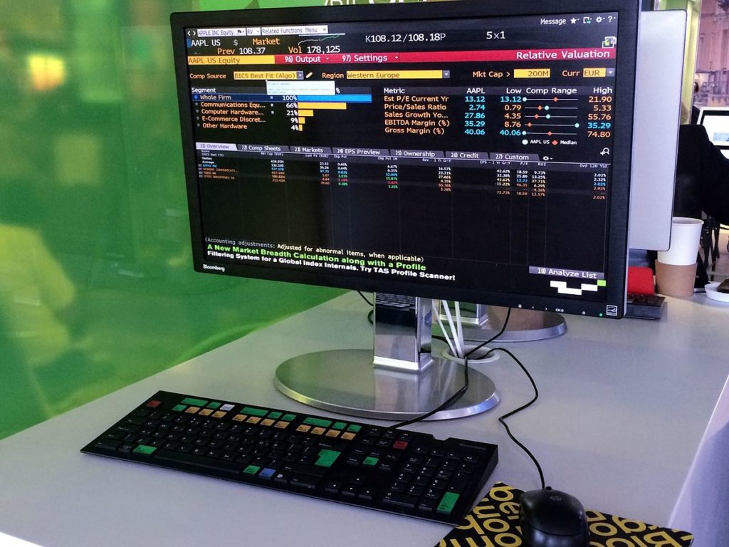
Years ago, I was freelancing with a startup that provided stock strategy screening and backtesting for financial advisors. I talked to potential customers and learned many things, including that they preferred information dense layouts, and they liked the look of the Bloomberg terminal.

The interface I put together made the activities easy to accomplish, and to make customers feel more at home I used an information-dense layout on a dark background. I thought it looked nice, and early customers didn’t complain. I took it as an affirmation that my work was satisfactory for customers.
Some time later, as I was winding down my role with this company, the startup’s founder brought on a project manager who had his own opinions on design. He thought the interface polish I had used was wrong, in particular he loathed the dark background. So this PM colleague put time and energy into updating the look & feel to his vision. I didn’t really fight it because it wasn’t going to be my responsibility for much longer.
So what happened? Customers didn’t complain. I don’t think they really even noticed that the look & feel had shifted drastically. Nitpicking the interface design didn’t produce any real benefits for this company.
For me, this was a valuable lesson that the heart and soul of product and UX design is the solving of meaningful problems. If you can help customers do what they’d like to do, they won’t really care what your interface looks like as long as it’s reasonably polished.
That being said, visuals and branding still do have value, but more so as a means of amplifying a solution. Perhaps this is why Apple’s products and interfaces are such a delight to use, they solve a problem and then amplify that solution with pleasant UX.