Originally Published: September 29, 2015
Peek-friendly webpages for Apple’s 3D Touch
Apple’s iPhone 6S and 6S Plus have a new form of gesture interaction called 3D Touch. With 3D Touch, the device can detect the pressure you’re putting into a press, activating different functionality.
In Safari, users can hard-press on links to preview the next webpage. This action is known as Peek and Pop. Peek can also be used in Mail to preview an email without having to load the full message, and in Messages to look at a photo or video. Third-party apps and games are on the way that take advantage of 3D Touch in other ways.
I was skeptical of 3D Touch, but after using it for a few days, 3D Touch is clearly a pleasant innovation for touchscreen interaction.
So that means that developers need to adjust to a new world where users will be Peeking at content.
Peek-friendly content
Here’s an example from the New York Times of what makes for a great Peek. I did a Google search for Donald Trump, and I just wanted to get a quick idea of what would be on the next page.
This Peek is perfect. It loads quickly, gives me a tasteful, appropriately-sized photo. I get the title of the article, and a subhead. Based on the Peek, I would probably proceed to the page.
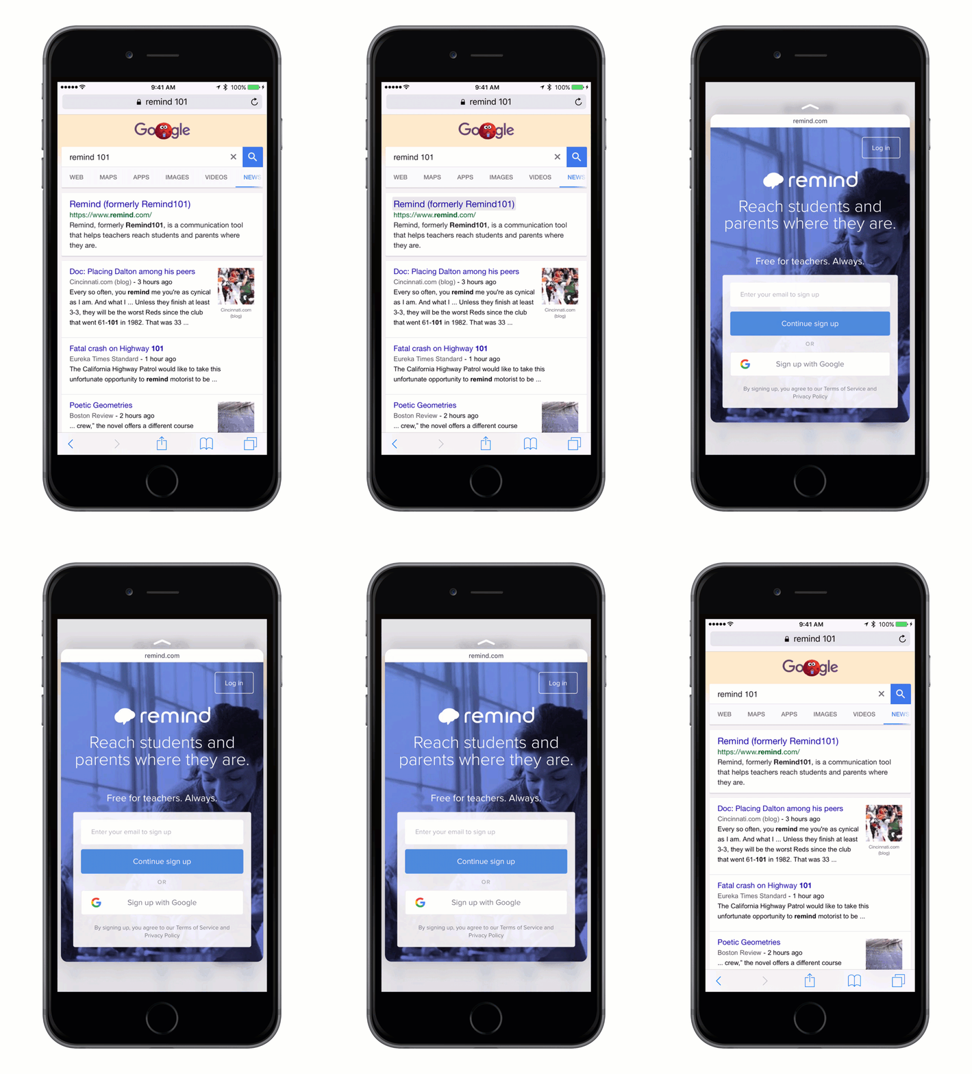
Here’s another example, from a rapidly-growing tech startup.
Awesome! A big, friendly portrait of what I can expect when I load through.
Peek-unfriendly content
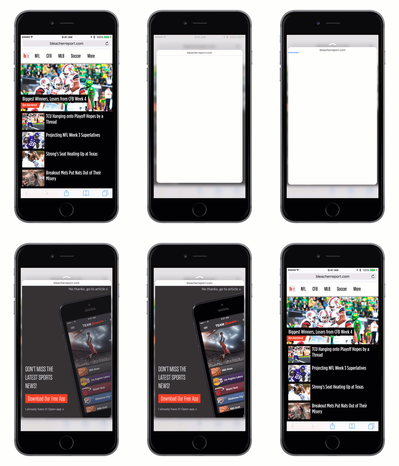
Now let’s take a look at poor Peek experiences.
The preceding GIF shows the website of a popular sports website. They give you a splash page advertising their native app before you can view the article. In traditional navigation, this is annoying, but simple to overcome. For a visitor peeking at the page (before moving forward), it may mean skipping altogether.
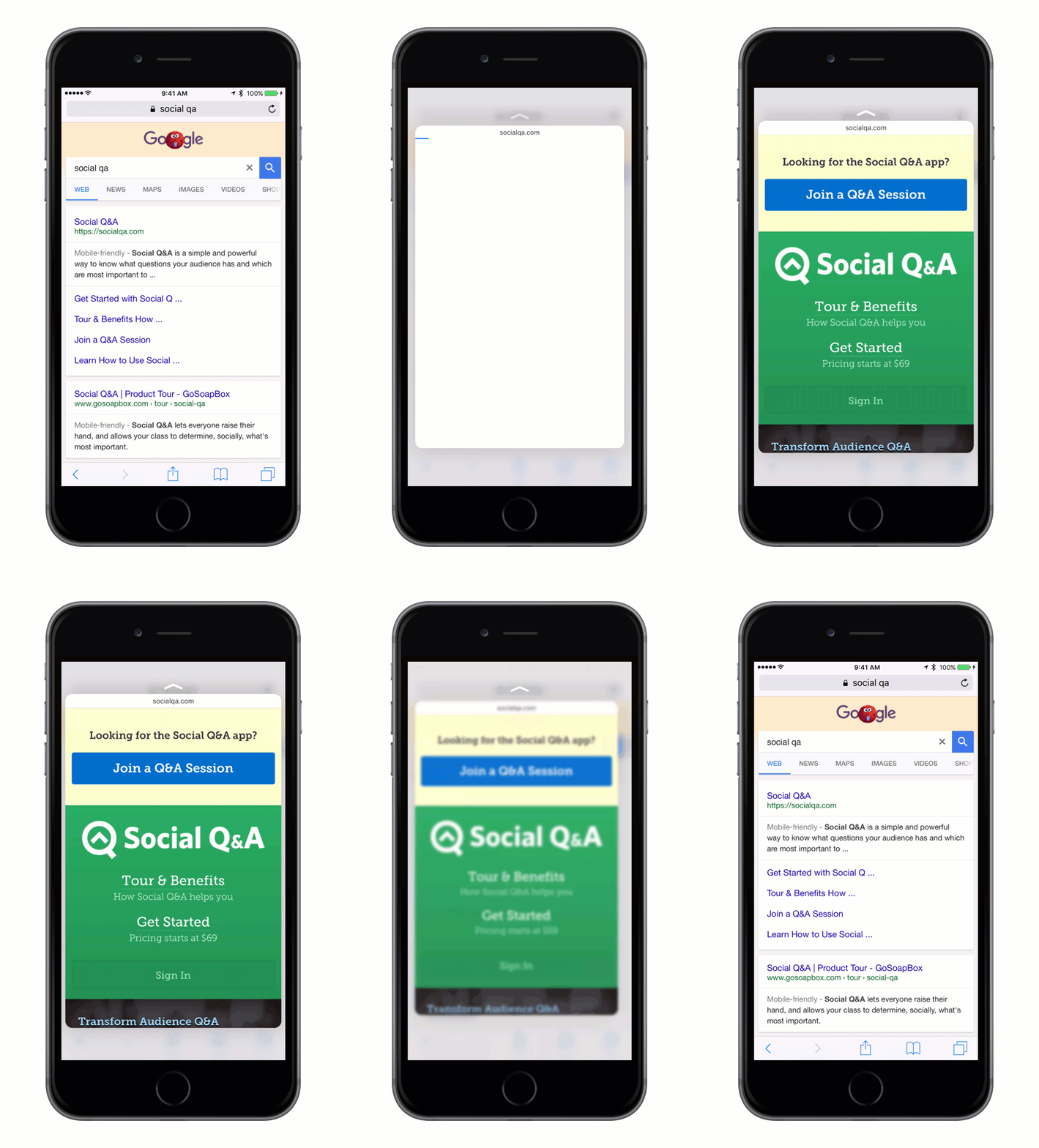
In the next example, Peek shows a webpage with a standard mobile header. The standard header keeps relevant content down on the page.
Because I can only preview a sliver of what this page is about, I may not tap through.
Taking advantage of Peek
Developers and designers, then, can take advantage of Peek by creating webpages that provide more content, and super-fast. And this can probably only be done by making the page itself considerably better for everyone. As far as I can tell, it’s not going to be possible to detect when a user is Peeking at a page, versus having it regularly loaded in Safari.
Best practices for Peek-friendly content
In considering good Peeks, it’s obvious that a well-designed mobile page will also make for a great Peek. But there are a few more considerations.
- Don’t use splash/interstitial pages that load for first-time visitors.
- Don’t use webpage popups that load for first-time visitors.
- Restrict the vertical height of your mobile header.
- Provide a clean glimpse into the page’s content.
- Make sure that pages are optimized for load time.


