Originally Published: December 14, 2011
Why mobile creates the perfect storm for UX innovation
People forget that not too long ago, mobile user experience was abysmal. Data speeds were on par with dial-up, providers charged extra to access basic phone features, and only a handful of developers were working to make things better.
Early adopters were frustrated, but they benefited from accessing the web anywhere. It was a shitty web, but it worked.

In 2007, Apple introduced the iPhone, ushering in a new era for the interface: touch. One year later, the App Store gave developers a distribution channel and empowered iPhone owners to get even more out of their devices. Apple’s near-absolute control over experience has been criticized by some, but it has guaranteed a high quality of use. Despite rolling out their own touch screens and app stores, competitors have struggled to get users to love their devices.
Today, we see a future for mobile beyond the interface. Mobile is an emerging mass media: it is personal, always on, and always connected. As users, we immerse ourselves in our devices. Our devices, in turn, become an extension of our self.

Despite looking past the interface, we still recognize that its role is more important than ever.
Product designers once treated usability as a nice-to-have. Well, this thing works, and it’s swell that it’s fairly easy to use. Over the last decade, usability has slowly transformed to become an end in itself. Today, usability is a deliverable, a bullet point on a requirements document .. even a spotlighted feature for product differentiation.
User experience designers know that to succeed in the near-future, our work must be more than usable. Our products must be sticky and engaging. They must solve real problems. And they must have flow.
 Flow is an academic term coined by scholar Mihaly Csikszentmihalyi, whose name I have never attempted to pronounce. According to Csikszentmihalyi, flow describes a state of user engagement in which an interface puts up zero resistance. This is when we, as users, are most productive. We are in the colloquial “zone”.
For example: Tennis players do not actively think about how to strike the ball. They just hit it, and when they do so it can be said that they are in a state of flow with their racket. It’s a part of their being, a tool for accomplishing something greater. The interface of a racket is invisible to its users because its designers have worked hard to make it invisible.
Mobile is uniquely positioned for a user experience revolution
Constraints force designers to focus on the core
If a desktop web designer was responsible for creating a tennis racket, you might see colorful painting, an obtrusive display indicating last strike speed, and a meter informing its user how close he or she is to the endline. (Re-reading that line, it sounds like a tennis racket I’d find at The Sharper Image).
When you introduce constraints like limited screen real estate, you end up focusing on what’s important and executing that very well. Let me repeat that. Constraints force designers to focus on the core, and do the core well.
Touch screens enable natural behavior
On a touchscreen, users directly manipulate digital interfaces with their fingers, using patterns similar to interaction with physical objects. When you’re playing the classic guitar app on an iPad, you’re not strumming real chords — but you are holding the iPad like a guitar and using the same kinds of motions. It feels much more authentic than an old-school point-and-click mouse. Can you even imagine playing the guitar by clicking and dragging?
By borrowing conventions from the physical environment, interaction with a well-designed touchscreen app can create flow.
Mobile is always with us
Our mobile phones are always on our person, and apps allow us to apply the utility of our devices in more and more contexts. Heading out to the store? You can use your phone to navigate roadways and aisles alike, compare prices, peruse shopping lists, check reviews … and when it’s time to fork over money, you might be using Google Wallet or Square.
There will be an app for every context, and an interface will be bundled with every app. Interfaces with flow will be the interfaces that win.
Siri: Beyond touch
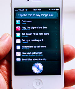
 Though Apple’s iPhone 4S launch lacked a major hardware upgrade, it did include a piece of software that threatens to disrupt everything we know about visual interfaces.
I’ve already written a bit about Siri. My take is that voice interfaces will ultimately win the fat end of common transactions, like setting reminders and finding single data points.
Siri’s interface is literally invisible, and what we see today is only a taste of what’s to come. Users are limited to bite-size chunks of hyper-efficiency, but they will be able to a lot more when third-party developers are given access to build atop Siri’s foundation.
Though I am excited about the potential of voice interfaces for common mobile transactions, flow is still an incredibly important topic for touch interfaces. Can you imagine playing Zombie Gunship through voice-activated commands? Me neither. I suppose, though, that Siri would make a game of Battleship more fun.

Summing it up
Flow and mobile are a perfect storm for user experience, catalyzed by mobile context, design emphasis on core features, and natural interfaces.
*Battleship photo credit to John-Malone on Flickr.