Originally Published: August 19, 2011
Autosuggest is now a basic expectation for search
Basic expectations are critical to the success of a new product. They represent the threshold of functionality for users to consider sticking around.
 Microsoft Word has an autosave feature — if your computer crashes, you can trust that your document is safe. Autosave’s introduction years ago was a delightful addition. Today it is essential. Users can no longer imagine office software without autosave. When Google purchased Writely to jumpstart Google Docs, it became apparent that users expected Word’s online equivalent to have autosave. And it absolutely had to work. The next time you’re editing a Google Doc, check out how often the save button is working.
Designing for delight also considers basic expectations. One variation of the philosophy says that you can build wonderful products by meeting the baseline and adding simple but clever hooks.
Let’s take a look at search
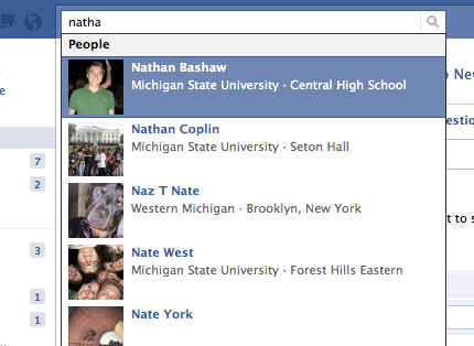
 Search is the primary way we navigate applications built on a bottom-up model. This includes websites we use every day like Google, Facebook, Amazon, LinkedIn, and IMDb. We don’t drill down through categories to find a friend’s profile or a movie title — we search because search tends to be efficient when you know the keywords you’re looking for.
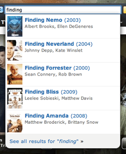
Autosuggest speeds the process. While users are typing, likely results splash in a dropdown beneath the search box. Looking for Finding Nemo? No need to waste precious seconds on a search results page when you can jump directly to your destination.
It’s the digital equivalent of Monopoly’s “Advance to Go, Collect $200” Community Chest card.
(IMDb’s useful autosuggest is particularly ironic given how I rail on them for not autofocusing their search box.)
Pay attention the next time you search. Autosuggest is everywhere.
Google Search


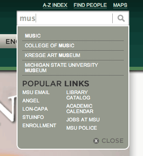
Michigan State University

Mobile
Autosuggest is of greatest value to mobile users. Why is that?
Text input on mobile devices is tedious. Mobile users will take an extra moment to consider query keywords and then choose the shortest option still likely to bring up accurate results. This behavior is even more pronounced when we’re rushed or distracted, which is always.
If you’re interested in mobile search and autosuggest, check out Greg Nudelman’s tap-ahead mobile search pattern.
Is autosuggest a basic expectation?
For bottom-up websites and applications and mobile search, a strong argument can be made that users expect some form of autosuggest.
For example, checking in on foursquare had been problematic for me until a recent update. I would literally be standing in a coffee shop I’d checked into dozens of times and it would not be listed among the first few location-generated places. This was frustrating, but autosuggest combined with search history was enough to keep me using the app until they fixed their algorithm.
A lack of autosuggest may not always be a deal-breaker, but it will certainly be frustrating.
Top-down websites and applications may not need autosuggest, partly because search is less important in this context but also because design resources in top-down are best spent developing effective content, labels, and organization.
What about Apple.com?
 You’re probably thinking, hey what about Apple.com?
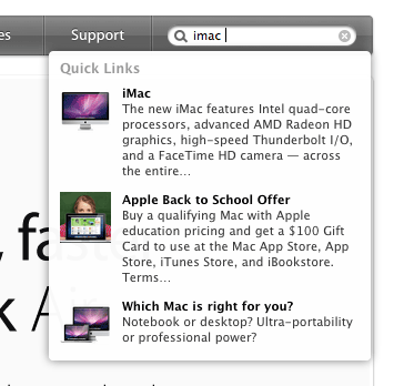
And you’ve made a great point. Apple’s homepage uses effective top-down navigation, but they’ve recently added search autosuggest. Unfortunately, it’s not clear what is being searched.
- Product pages? Absolutely.
- App Store? Some apps.
- Music Store? Some albums.
My best guess is that Apple’s autosuggest is editorialized. They’re watching search trends and only adding popular destinations.