Originally Published: November 13, 2010
The usability of traffic lights
Traditionally, the traffic control signal consists of three vertically-stacked lights: Green, at the bottom means go, yellow instructs drivers to stop if they can do so safely, and red at the top demands complete cessation of movement. For drivers, this informations is neither new nor interesting. We have seen these signals our entire lives.
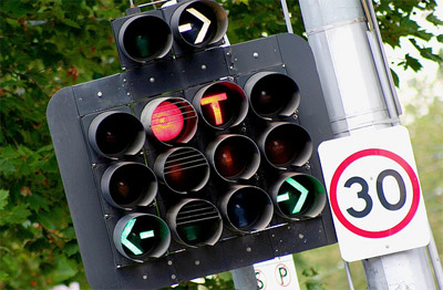
Innovations in the traffic light have been rare. An outright change in the entire design requires extensive driver education, so new ideas are tacked onto what already exists. Left and right turn signals are easily welded on, and sensors can detect traffic flow to optimize light lengths.

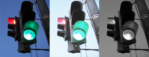
While the traditional traffic control signal undoubtedly works, it has drawbacks. Looking at a poorly-lighted signal through blinding daytime sun can be difficult even for a person with perfect vision. If you happen to be colorblind, you are forced to rely on the position of the light.

When developing usable and accessible web interfaces, we are taught to avoid using color as the only indicator of interaction. For example, you would not want to inform a user that the required fields in your registration form are red. Someone using a screen reader or someone who is colorblind will be unable to decipher what is required and what is not.
Though traffic control signals use color and position to instruct drivers, they teeter dangerously close to the line of accessibility. Some American cities string horizontal lights with red on the left and green on the right; if you have never seen that style of traffic light before, you may be confused. On the road, mistakes at an intersection can be life-or-death situations; there is a clear social interest in designing intuitive traffic control signals.
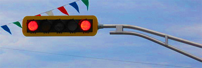
In some parts of Canada, a horizontal, double-red style is used to make it clear when drivers need to stop.

The double-red style adds a third indicator for stopping: color, position, and number of lights currently on. It also turns out that driver satisfaction increases, across the board, with the double-red style.
My own contribution to this discussion is to request an indicator that alerts drivers to the amount of time remaining on a green light. Some European countries add a subtle blink toward the end of the green cycle; drivers seeing that blink then know the signal will soon be changing and can mentally prepare to stop. My vision would add some sort of strobing stroke outside the green light as it winds down toward the end.
For something we see and use every day, we do not often consider the accessibility of traffic control signals. Can we do better?
Resources